Picturehouse
concessions ordering App

overview

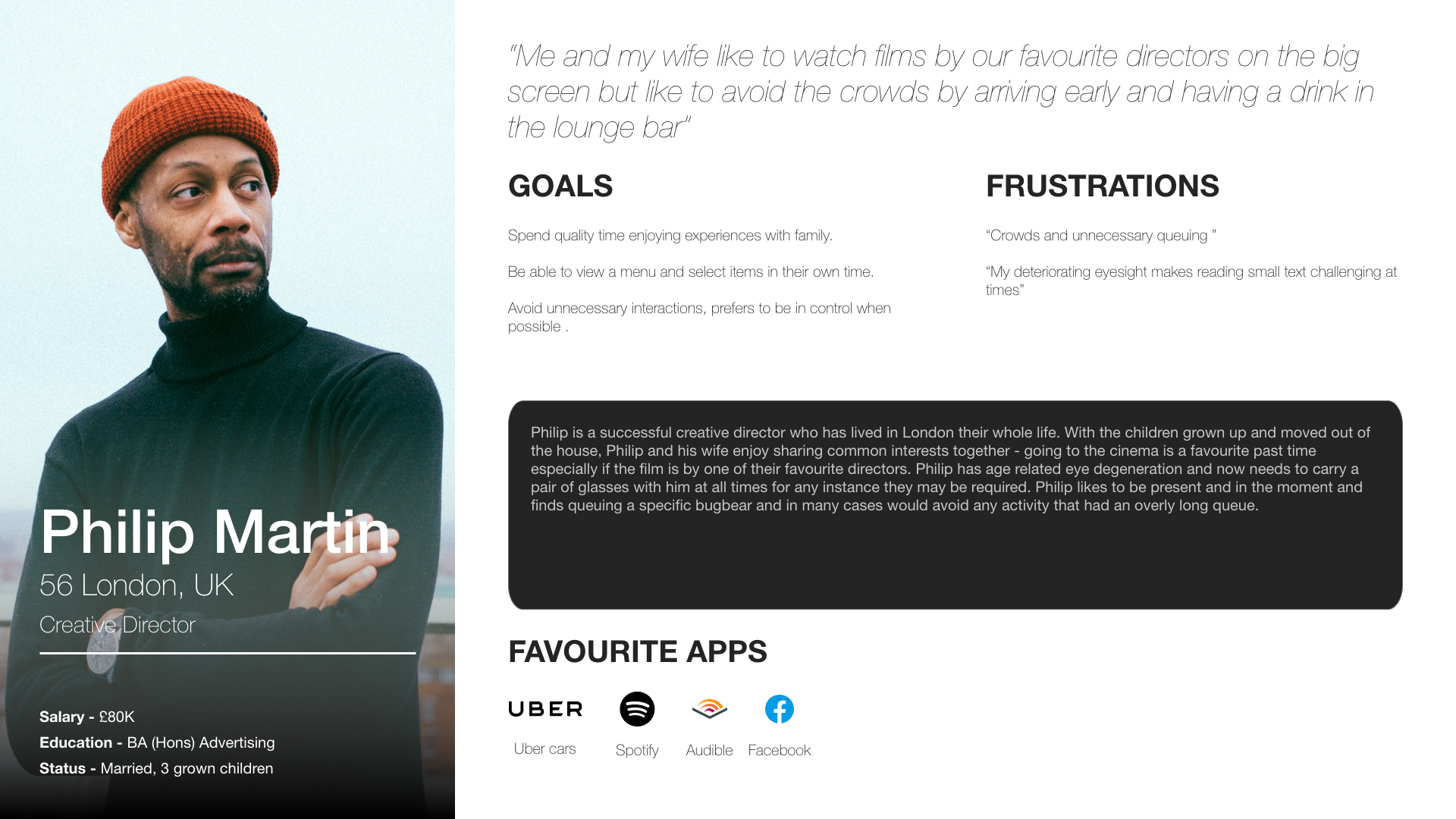
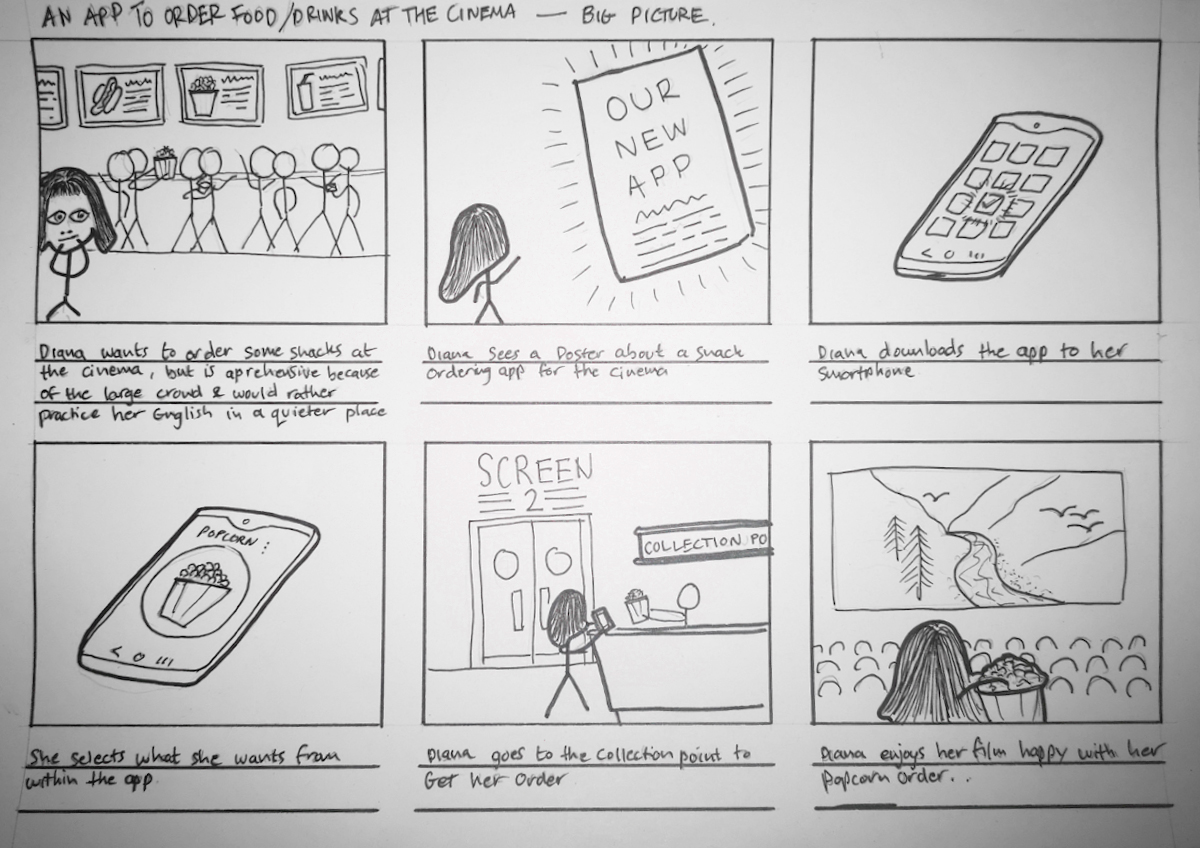
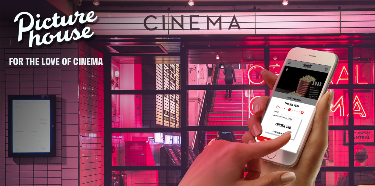
Picturehouse is a neighbourhood cinema chain that offers an intimate, character-rich alternative to the typical 24-screen multiplex. Each venue blends film with a welcoming bar and café atmosphere, creating a social hub for the local community. But smaller venues also mean smaller waiting areas — and with large audiences often arriving at the same time, queues for food and drink can quickly build.

As part of my Google UX Design Certificate, I was tasked with identifying a real-world challenge and designing a digital solution. For Picturehouse, the challenge was clear: concession sales weren’t reaching their potential, and long queues were affecting both customer satisfaction and revenue. This project explored how a dedicated mobile app could address these issues while preserving the relaxed, sociable feel that defines the Picturehouse experience.
role
Sole Product Designer
focus
user Research, usability testing, UX/UI Design, Prototyping
tools
figma, photoshop

problem

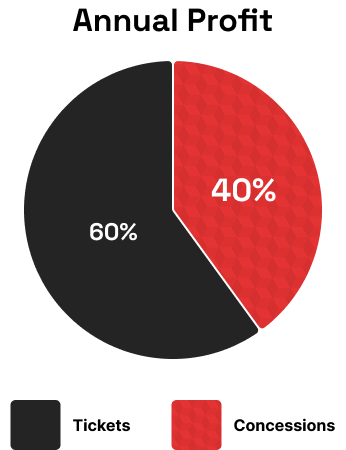
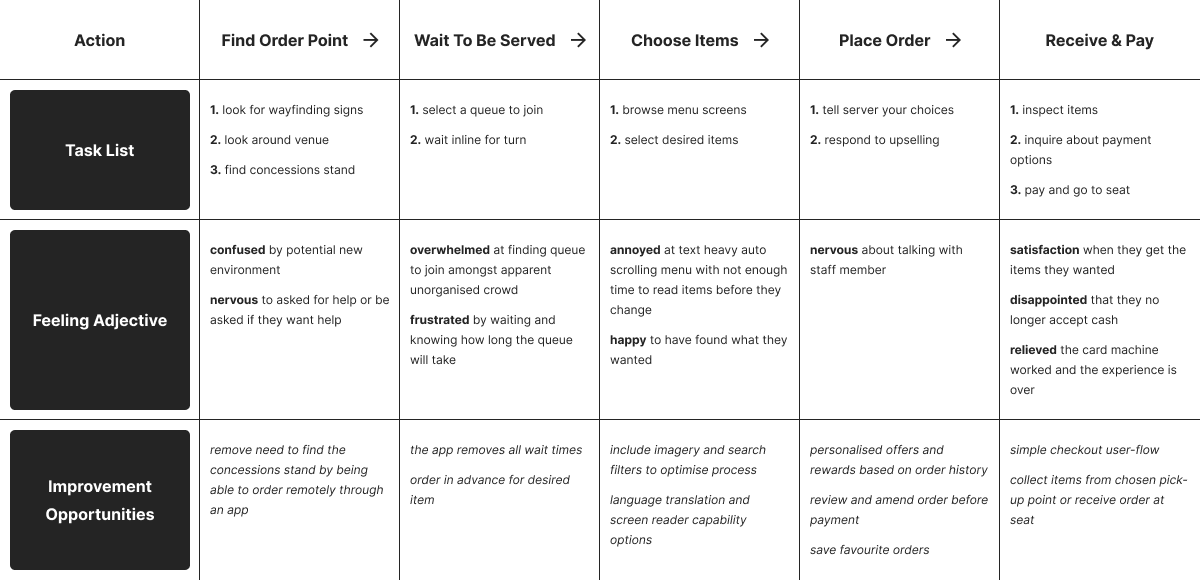
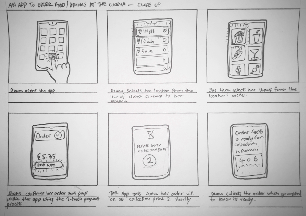
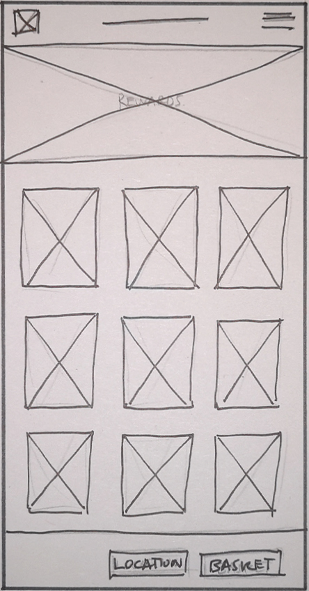
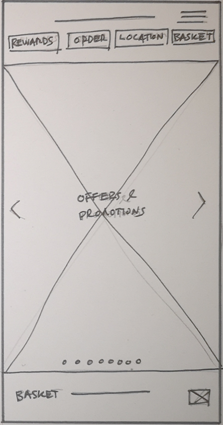
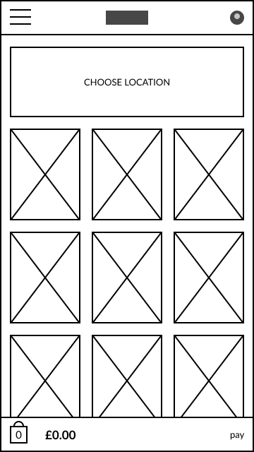
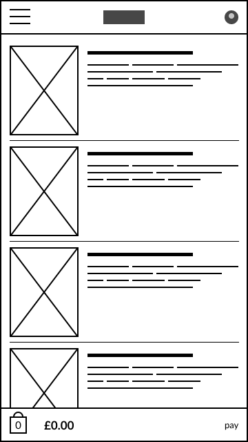
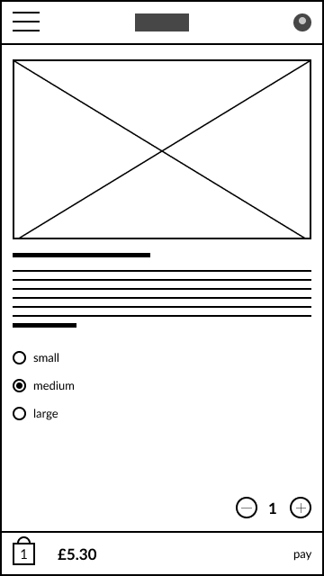
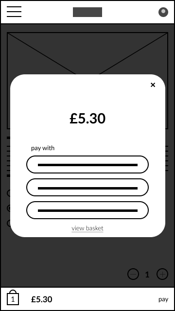
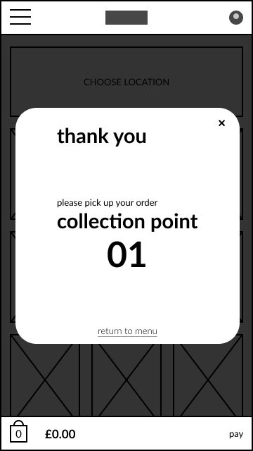
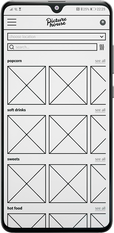
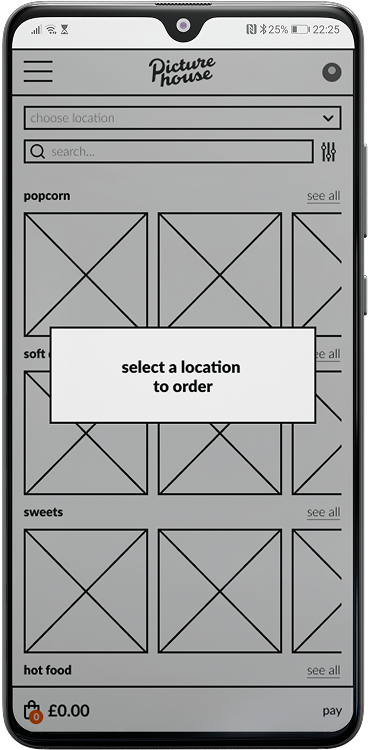
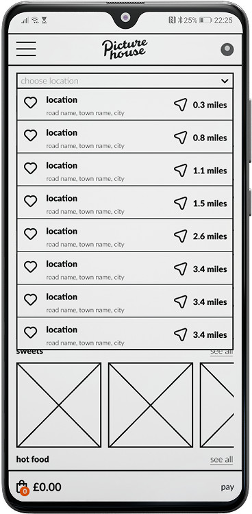
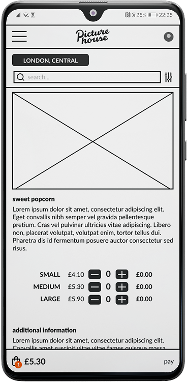
For many cinema-goers, buying food and drinks can be the most frustrating part of their visit. Long queues before showtime or during the interval can lead to missed scenes, rushed choices, and a less enjoyable experience overall. For cinemas, this can result in lost sales opportunities, slower service, and operational bottlenecks.

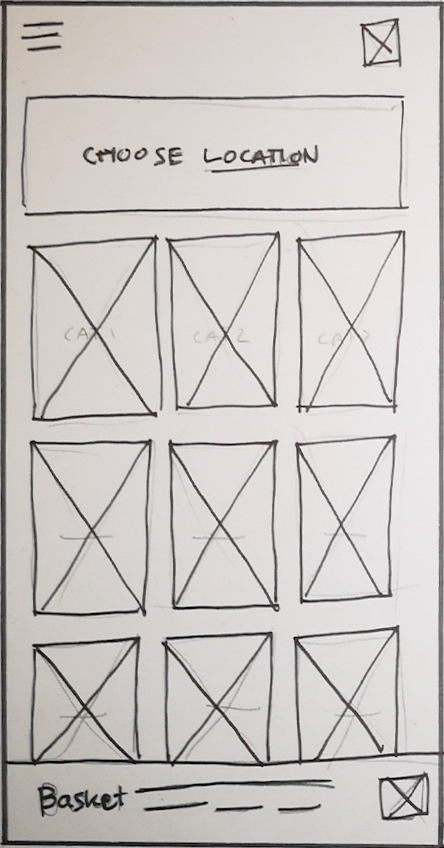
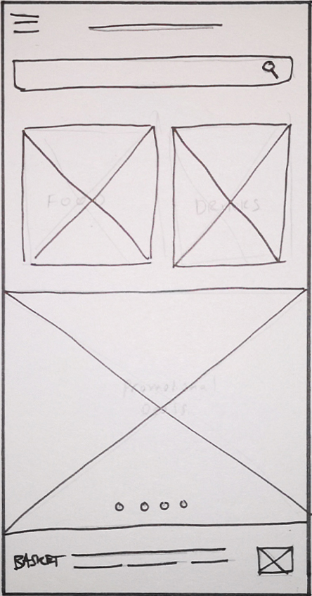
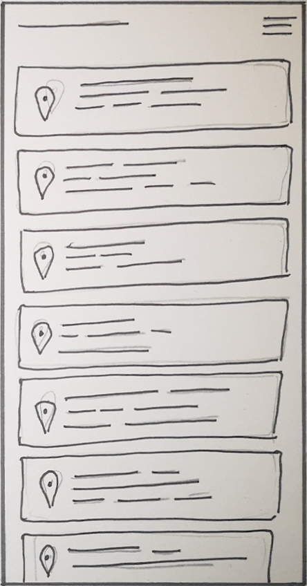
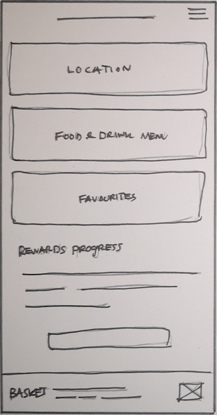
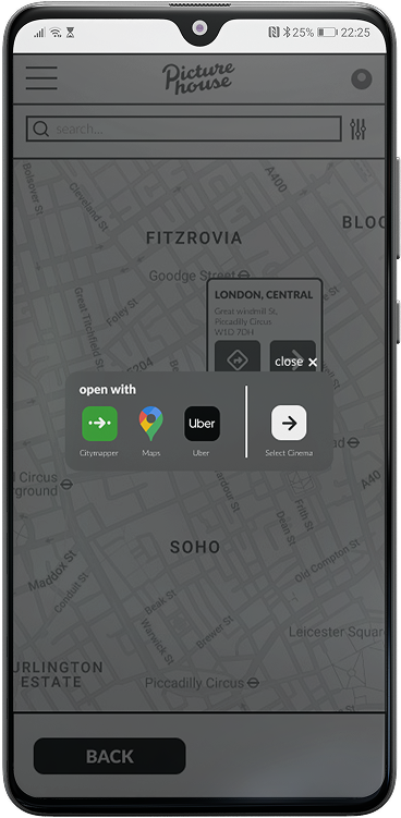
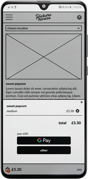
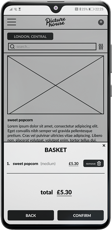
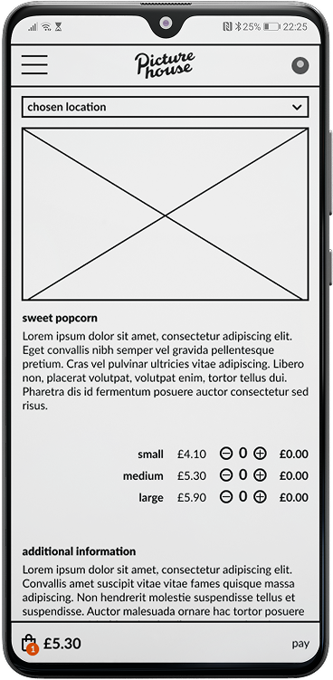
Customers need a quick and intuitive way to browse menus, customise orders, and pay without standing in line, while staff need a system that integrates smoothly with their workflows to keep operations running efficiently. The challenge was to design a mobile ordering solution that improved the experience for both audiences and cinema teams.
jump past the process to view the solution

process

Great design doesn’t happen by accident. I broke this project into five structured phases to help uncover user needs, shape meaningful solutions, and deliver a product that balanced functionality with usability.
1. discover
Gathering insights through competitive analysis and interviews.
2. define
Synthesising user research to define project goals and priorities.
3. develop
Structuring information architecture and sketching screens.
4. deliver
Finalising a high-fidelity prototype with all key interactions.
5. distil
Reflecting on usability study outcomes and key learnings.
discoverdefinedevelopdeliverdistiltop

discovery

I began this project by looking at the problem from three key angles: the business, the market, and the user. I conducted foundational research to understand the commercial landscape, the competitive environment, and the needs of the people I would be designing for. This initial research phase allowed me to ground the project in real insights, ensuring that every design decision was intentional and purposeful.
market research
To understand the commercial context of this project, I first researched the UK independent cinema market. My goal was to identify key business opportunities and pain points that would make the project a valuable investment for a company like Picturehouse.
annual profit pie chart
To understand the commercial context of this project, I researched the financial impact of concessions. My findings showed that even though they are a small part of a cinema’s physical space, they account for a massive 40% of all profits, with the remaining 60% coming from ticket sales and other revenue streams. This proved that improving the ordering process wasn't just about convenience—it was a major business opportunity.
missed opportunity bar chart
I  researched the pre- and post-movie behaviour of cinema goers to understand where they spend their money. My findings showed a clear opportunity: a significant number of customers are taking their business elsewhere. A staggering 55% of cinema goers purchase food or drinks at a different venue as part of their visit, representing a huge amount of lost revenue for the cinema. This proved that a seamless ordering app could help recapture those sales and keep a customer's entire experience on-site.
shifting demographic donut chart showing increase in cinema goers aged 18-34
I also researched the evolving audience of independent cinemas. I found that while the traditional audience has been older, there is a significant shift toward a younger, more tech-savvy demographic. For example, some venues have seen attendance from the 18-34 age group nearly double in just a few years. This confirmed that a mobile-first solution would be a great fit for their habits and preferences, validating the decision to design a mobile app.
competitive audit
To understand how a Picturehouse ordering app could deliver a smooth and engaging experience, I analysed both direct competitors in the cinema space and indirect competitors known for their excellence in mobile ordering.


This allowed me to benchmark not only industry standards but also best practices from beyond the sector.
odeon logouber eats logostarbucks logo
user research
To ground my assumptions in real user needs, I conducted foundational qualitative research. My informal interviews and personal analysis led to three key themes: Friction & Frustration, the Need for Flow, and Key Opportunities. These findings directly informed the entire design process, ensuring our solution was built on genuine user needs.
friction & frustration
"The queue for snacks is always so long just before the film starts. It feels like a race against the clock and I'm always worried I'm going to miss the opening scene."
User A | 50s | Healthcare worker
friction & frustration
"I've just given up on getting snacks. By the time I get my popcorn and drink, I have to rush into the dark cinema and awkwardly try to find my seat."
User B | 30s | Sales
Need for Flow
"I come to an independent cinema for the atmosphere, not the hassle. An app should just make getting my snacks easier so the whole visit feels smooth."
User C | 60s | Architect
Need for Flow
"It's annoying when you can't even browse the full food menu from your phone beforehand. I feel rushed and just grab the first thing I see."
User D | 30s | Designer
Key Opportunities
"Being able to pre-order would be a game changer. I could just walk in, pick up my order, and find my seat without any stress."
User E | 20s | Student
Key Opportunities
"If an app could save me from trying to juggle my drink, popcorn, and ticket to find my seat, I'd definitely use it. The small things make a big difference."
User F, | 40s | Tech

define

With the research and data gathered in the Discovery phase, the next step was to synthesise this information to build a clear picture of the problem and the people we are designing for. By creating an affinity diagram to organise our insights, a persona to represent our user, and a user journey map to visualise their experience, we established a strong foundation that would ground every design decision that followed.
affinity diagram
With a significant amount of data from my initial research, the first step was to synthesise my findings. I created an affinity diagram to organise user insights, competitive analysis, and key business metrics, allowing me to find crucial patterns and define the core themes that would serve as the foundation for this project.
user research
competitive audit
market research
affinity diagram post it notes
user personas
Understanding who visits Picturehouse was key to shaping an experience that felt authentic to their audience. I created personas to capture the needs and behaviours of two typical customer groups: younger international students looking for social, affordable nights out, and older professionals seeking a more curated cinema experience. These personas provided a lens through which design decisions could be tested against real-world expectations.
user journey map
To better understand the challenges of ordering food and drinks at Picturehouse, I mapped out Diana’s in-cinema journey. I chose Diana as the focus because her perspective as an international student introduced extra layers of complexity — such as navigating an unfamiliar environment and interpreting signage in a second language.
The journey begins once she arrives at the venue, and follows her through key steps like locating the concessions stand, assessing queues, and completing her purchase. Mapping this process helped reveal moments of friction (e.g. difficulty finding wayfinding signs, bottlenecks at the counter, limited waiting space) as well as opportunities to create a smoother, more intuitive ordering experience.
user journey map spreadsheet
insight summary
Diana’s journey through the concessions process revealed several friction points that affect both efficiency and enjoyment. From confusion when navigating the venue, to frustration with queues and inaccessible menus, to nervousness during staff interactions, her experience highlighted how small moments of uncertainty add up to a less-than-ideal visit. These insights pointed to clear opportunities: reducing reliance on physical wayfinding, removing waiting entirely through remote ordering, improving accessibility in menu design, and streamlining checkout. Addressing these would not only improve Diana’s experience, but also create value for a wider range of cinema-goers.
problem statement
Diana, an international student, needs a simple way to order cinema snacks because language barriers and time pressure make the current process stressful and confusing.
how might we
How might we create an ordering experience that reduces pressure, supports diverse language needs, and helps customers feel more in control?

develop

With a clear problem and a defined user in mind, the Develop phase was about moving from insight to action. I began the process by generating a wide range of ideas, then systematically refining them through wireframes, prototypes, and user feedback. This iterative approach ensured that the final design was not only well-considered but also genuinely effective for the user.
story boards
Before designing any screens, I first created a storyboard to visualise Diana’s ideal journey with the app. This helped me to identify the key interactions and to ensure my design would solve her core problems in a sequential, logical way.
sketch wireframes
After visualising the ideal user journey, the next step was to rapidly translate those ideas into tangible screens. I began with initial sketches and paper wireframes to explore a wide range of layouts and concepts. This low-fidelity approach allowed me to quickly test different design solutions without getting bogged down in visual details, laying the groundwork for a more refined digital flow.
sketch wireframe
sketch wireframe
sketch wireframe
sketch wireframe
sketch wireframe
sketch wireframe
lo-fi wireframes
With the core concepts validated through sketching, the next step was to translate these ideas into a clear, digital flow. I created low-fidelity wireframes to establish the app's structure and information architecture, which then evolved into a mid-fidelity design with key copy and icons. This provided a realistic foundation for the app's core user journey.
lo fi wireframe home
lofi wireframe menu
lofi wireframe item
lofi wireframe payment
lofi wireframe payment confirmation
usability study
To validate my design assumptions, I conducted a moderated usability study with five participants. Using a task-based approach, I observed their interactions with the mid-fidelity prototype, recording their click paths and behaviour. The study utilised a hybrid data collection method, combining qualitative insights from user quotes and observations with a quantitative scoring system to measure task completion and identify friction points. This methodical approach provided clear, actionable data that directly informed the next phase of design iteration.
cart icon
Confusion with Basket Management
person icon redperson icon redperson icon redperson icon greyperson icon grey
3 out of 5 users had trouble either locating or removing an item from their basket.
Users need a more intuitive and easily recognisable way to both view and manage the items they have added to their basket.
“I spent ages looking for my order, I thought it was missing or that I hadn't added it to the basket properly. I’ve used apps before where you add stuff and it just vanishes.”
location icon
Unfamiliar Interaction Patterns
person icon redperson icon redperson icon redperson icon redperson icon grey
4 out of 5 subjects were confused by the add location pop-up prompt.
The design should use a more intuitive and familiar pattern for location-based actions.
“I didn’t expect that pop-up. It felt like I was being taken out of the app and I wasn’t sure what I was supposed to do next.”
plus icon
Usability & Accessibility Issues
person icon redperson icon redperson icon greyperson icon greyperson icon grey
2 out of 5 users found the buttons difficult to use.
The design should use more adequately sized buttons and interactive elements to improve usability and accessibility for all users.
“I had to tap that button a few times. It felt a little too small and I wasn't confident I was hitting the right spot.”
Key Findings & Iterations
The insights gained from the usability study provided a clear roadmap for design iteration. This section visually showcases the design changes implemented to address the core user pain points. By directly comparing the "before" and "after" screens, we can see how the prototype evolved to create a more intuitive and seamless solution.
1. Addressing the Location Issue
Initial user testing revealed a fundamental problem in the app's flow that caused unnecessary confusion. This section outlines how the design was iterated to address a core usability issue: a confusing visual hierarchy that allowed users to make a mistake in the first step of the process.
before
The original home screen had a diminutive "Choose location" dropdown at the top that was easily overlooked by users. Due to a flawed visual hierarchy, the product categories commanded more attention, and users were drawn to them. When a user attempted to browse products before selecting a location, they were met with a confusing error message, leaving them unsure of how to proceed.
home screen
mid-fi prototype home screen
error pop-up
mid-fi prototype error screen
location drop-down
mid-fi prototype location drop down screen
after
To solve the onboarding friction, the design was iterated to create a dedicated location page at the beginning of the user flow. This change removed the confusing error message by forcing users to select their cinema first, ensuring a clear and logical path. Each location was represented by a card with a clear title and address, providing enhanced discoverability.

Additional features were integrated to improve the user experience, including the ability to favourite a cinema for easy access and a map view for clear wayfinding. The map view also provides a direct path to third-party navigation apps, such as Citymapper and Google Maps, or the option to book an Uber, anticipating the user's needs and creating a truly seamless, end-to-end journey.
location list
mid-fi prototype location list screen
map view
mid-fi prototype map view screen
navigation links
mid-fi prototype nav links screen
2. Addressing the Basket Issue
Usability testing revealed significant problems within the basket flow. With 3 out of 5 users unable to remove items from their cart, it was clear the design was causing frustration. Participants were often drawn to the wrong information due to an imbalance in visual hierarchy and were confused by similar icons performing different functions. As one candidate stated: “That icon wasn't very obvious, the size of the payment options within the basket was so big and I didn't realise my item was in there."
before
The initial basket design presented several points of friction. While the primary objective was for users to review their order, the screen's visual hierarchy was inverted, with large payment options drawing all the attention. The basket items themselves were small and difficult to identify, and the "x" icon to remove items was not intuitive to users.
basket before
mid-fi prototype basket screen
after
The basket was completely redesigned to directly address the usability issues uncovered in testing. The visual hierarchy was inverted to give the user's order primary focus, with improved spacing and readability. The confusing 'x' icon was replaced by a significantly larger "Remove" button with a bin icon, making the action much more explicit. The original confusing payment options were removed in favour of a clear "Confirm" button, giving the user a sense of control and a streamlined path to payment, along with an intuitive back button to continue shopping.
basket after
mid-fi prototype basket new screen
3. Addressing Usability & Accessibility Issues
Usability testing revealed a key physical interaction problem: some of the buttons were too small. While a minor issue on its own, it pointed to a need for more accessible and user-friendly design to prevent errors.
before
During the usability study, participants were asked to add a medium-sized sweet popcorn to their basket. After selecting 'Sweet Popcorn' from the main product list, users arrived at a product page where they could choose a size. The page presented three options—small, medium, and large—each with a corresponding set of plus and minus buttons to adjust the quantity. However, the small size of these controls made them difficult to operate easily, causing some users to miss the buttons or tap multiple times to complete the task. This highlighted an accessibility issue with the initial design.
item select before
mid-fi prototype item screen
after
To solve the usability issues, the product page was redesigned with an improved visual hierarchy. The size options are now more prominent and are centered on the screen with better spacing, making them easier to read. The plus and minus buttons themselves were made larger with a high-contrast, solid background, which drastically increased tap accuracy. The updated screen also directly reflects the user's location selection, displaying the chosen cinema at the top to reinforce the updated user flow.
item select after
mid-fi prototype item new screen

deliver

With the design validated and iterated upon, the final phase was to apply a polished, high-fidelity finish to the prototype. This Deliver phase is the culmination of all the research, synthesis, and testing that informed the design. It's a visual representation of the final product, showcasing the improved user flows and a refined user interface that directly addresses the problems identified in the usability study.
Locating Your Cinema
The initial location selection was a major source of friction, as a hidden dropdown and a confusing visual hierarchy led users to begin ordering products before selecting a cinema. To address this, the flow was redesigned to start with a dedicated Location Selection screen, which forces users to choose a cinema before advancing. The new design also provides a clear map view to help users confidently identify and select a location, while additional features such as favorite cinemas and third-party navigation plugins help streamline the entire experience from selection to arrival.
cinema selection
map view
Browsing & Adding Items
Usability testing revealed a key design challenge: small buttons that were difficult to use, as well as an overall lack of feedback that eroded a user's trust in the product. To address these issues, the product selection and ordering screens were redesigned to provide a clear, logical journey. The final design provides instant feedback with every tap, ensuring the user feels in control as they browse categories and add items to their basket.
product slection
add to basket
The Basket & Checkout
The original checkout screen was a major source of apprehension, as a confusing visual hierarchy and a lack of a clear user flow left guests feeling a lack of control. To address this, the entire checkout process was redesigned to be a clear and trustworthy path to success. The new basket screen is clearly labeled and uses a simple, multi-step flow indicator to orient the user. The design gives users a greater sense of control and confidence by adding a crucial "Confirm" Order button, which separates the basket from the payment process. The flow then leads to a dedicated payment screen and a final order confirmation, which provides a collection point and gives the user peace of mind.
checkout flow

distil

Having successfully delivered a high-fidelity prototype that directly addresses the core user problems, the final step is to reflect on the project as a whole. This section distills the key learnings from the research and design process, outlines potential next steps, and summarises what I'll take away from this project to improve my work in the future.
what i learned
  • The Importance of Early & Continuous Testing
    This project reinforced the importance of early and continuous user feedback. The initial usability study was crucial—it proved that my assumptions about the user's logical path were incorrect. This guided me toward a user-centered solution from the very beginning.
  • The Power of Visual Hierarchy
    This project was a powerful lesson in visual hierarchy. I learned that even in a mid-fidelity prototype, an imbalanced hierarchy can create significant user frustration. By using scale, spacing, and contrast effectively, I was able to guide the user's attention and create a more intuitive experience.
  • Validating the Design Before Delivery
    I learned the value of validating design decisions before delivery. Iterating on the mid-fidelity prototype first allowed me to test my solutions and confirm their effectiveness before committing to a final, polished design. This saved time and ensured the final product was built on a solid foundation.
what i would do differently
  • Time & Resource Constraints
    While the initial usability study yielded crucial insights, its small sample size was a limitation. Given more time and resources, I would have recruited a larger and more diverse group of participants to ensure the solutions were validated by a wider range of users. A larger test group would have provided more robust data, helping to uncover any edge cases and ensuring the design was truly accessible and effective for everyone.
  • Additional Feature Exploration
    The project's scope was focused on the core ordering flow. However, given the opportunity, I would have conducted further research to explore additional features that would enhance the overall product experience. This would include functionalities such as user accounts, order history, or a loyalty program. Adding these features would create a more complete and valuable product that encourages user retention and repeat visits.
next steps
  • Final Testing
    The most crucial next step would be to conduct a final round of usability testing with the high-fidelity prototype. This would validate that the visual polish did not introduce new issues and that the solutions to the location and basket flows were truly effective. It would also serve as a final check to ensure a seamless and intuitive user experience.
  • Future Features
    Looking ahead, there are several opportunities to enhance the user experience. I would explore adding a user account with order history, which would allow for easier re-ordering. A favourites list for specific cinemas or snacks would streamline future visits, and in-app notifications would keep users updated on their order status, creating a more complete and engaging experience.
  • Scaling the Design
    As the product grows, it will be essential to ensure consistency. A final next step would be to begin building a component library and style guide. This would establish a single source of truth for the design, which would not only ensure a consistent user experience but also streamline the workflow for future design and development teams.
picture house ad mock-up