Pointr
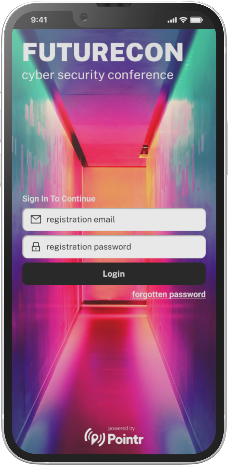
Conference Companion App

overview

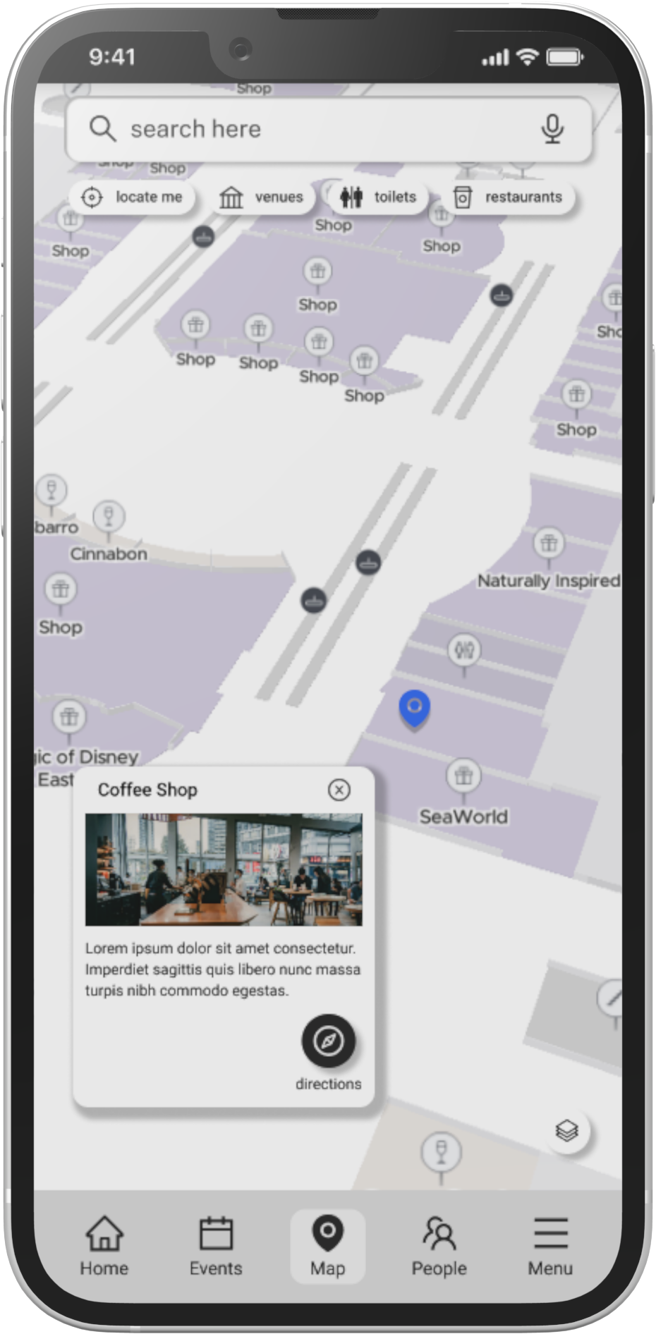
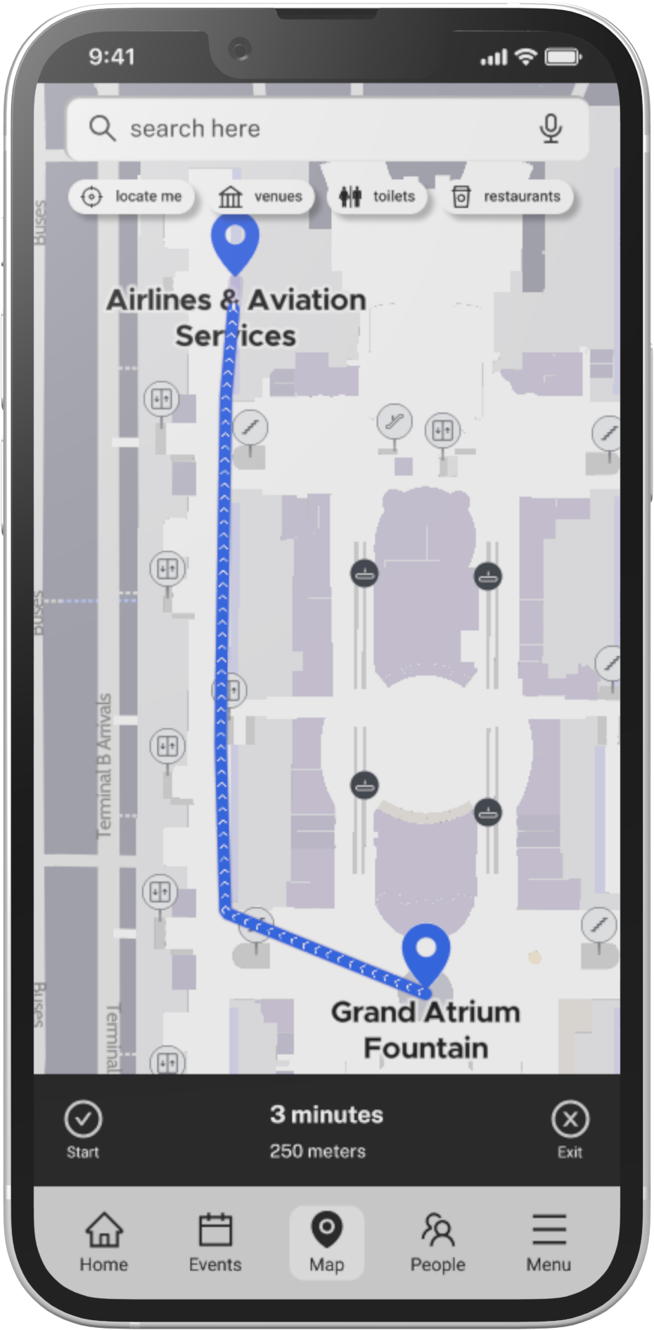
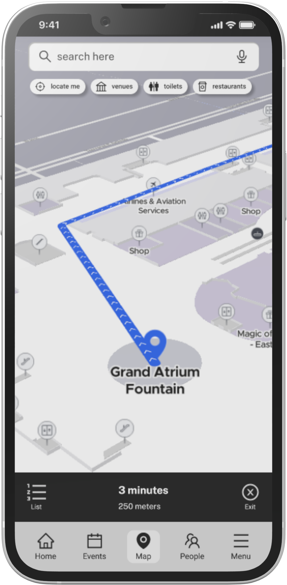
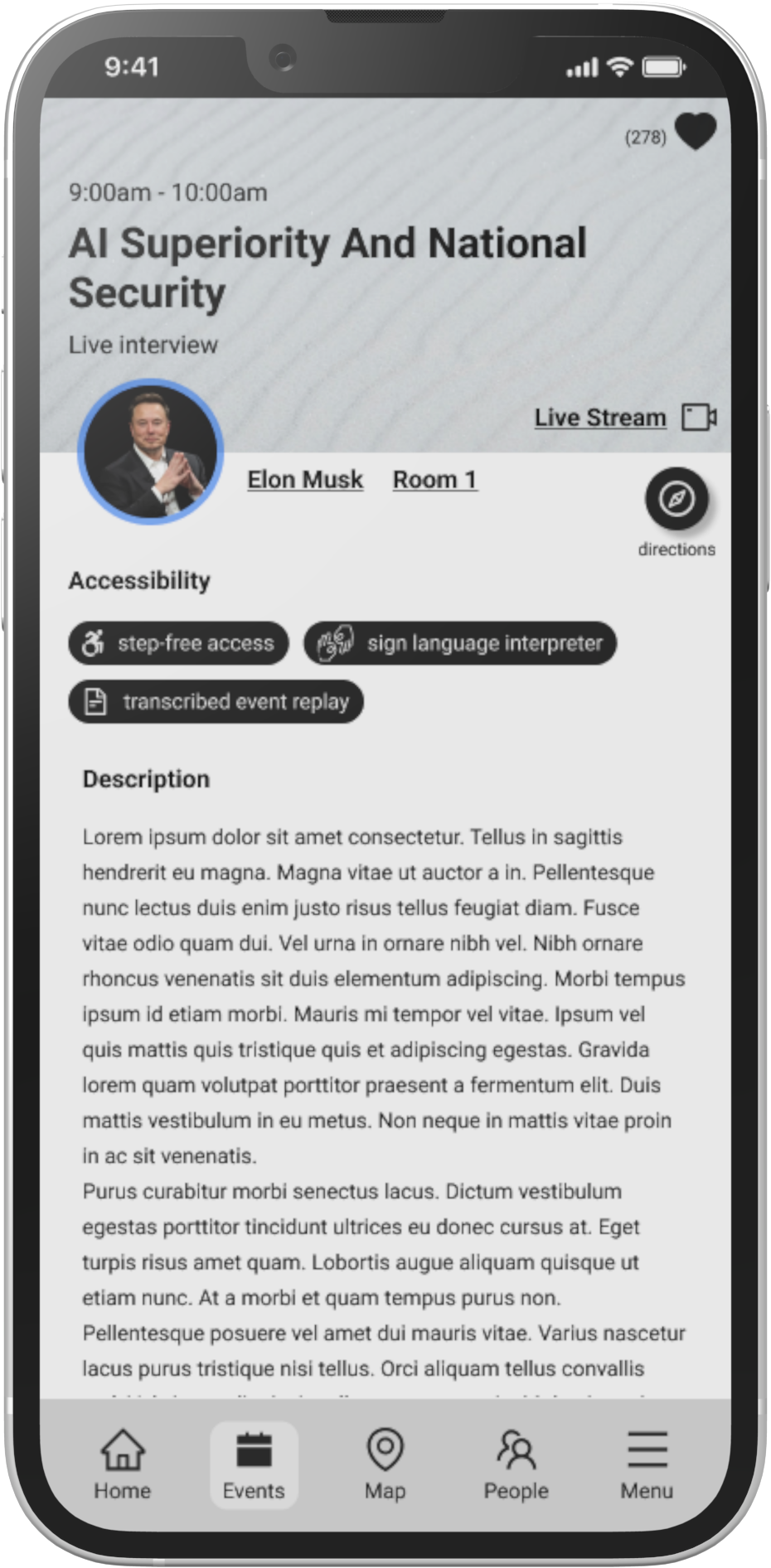
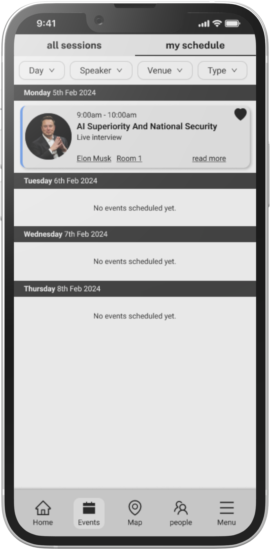
Pointr, a leader in indoor mapping technology, was exploring opportunities to expand their business into the conference sector. As part of a design challenge, I was tasked with creating a mobile app experience that would go beyond basic wayfinding to help conference organisers deliver a richer, more accessible, and engaging experience for all attendees. My goal was to design a solution that seamlessly blended intuitive navigation with tools that catered to diverse attendee needs and supported business objectives.
role
Sole Product Designer
focus
Research, UX/UI Design, Prototype
tools
figma

problem

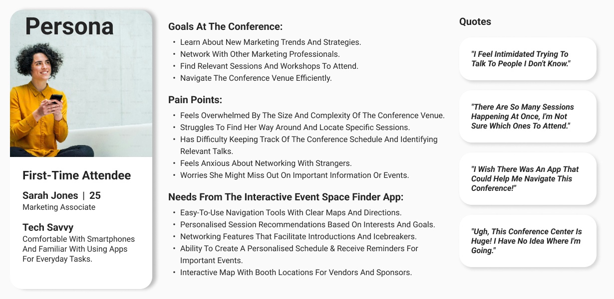
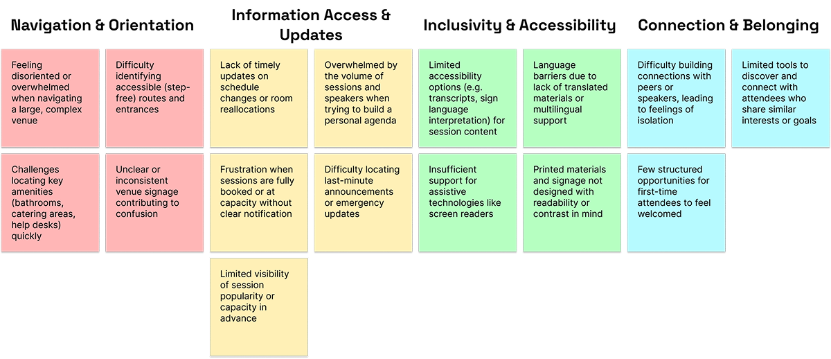
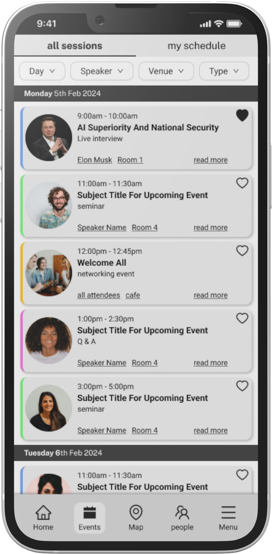
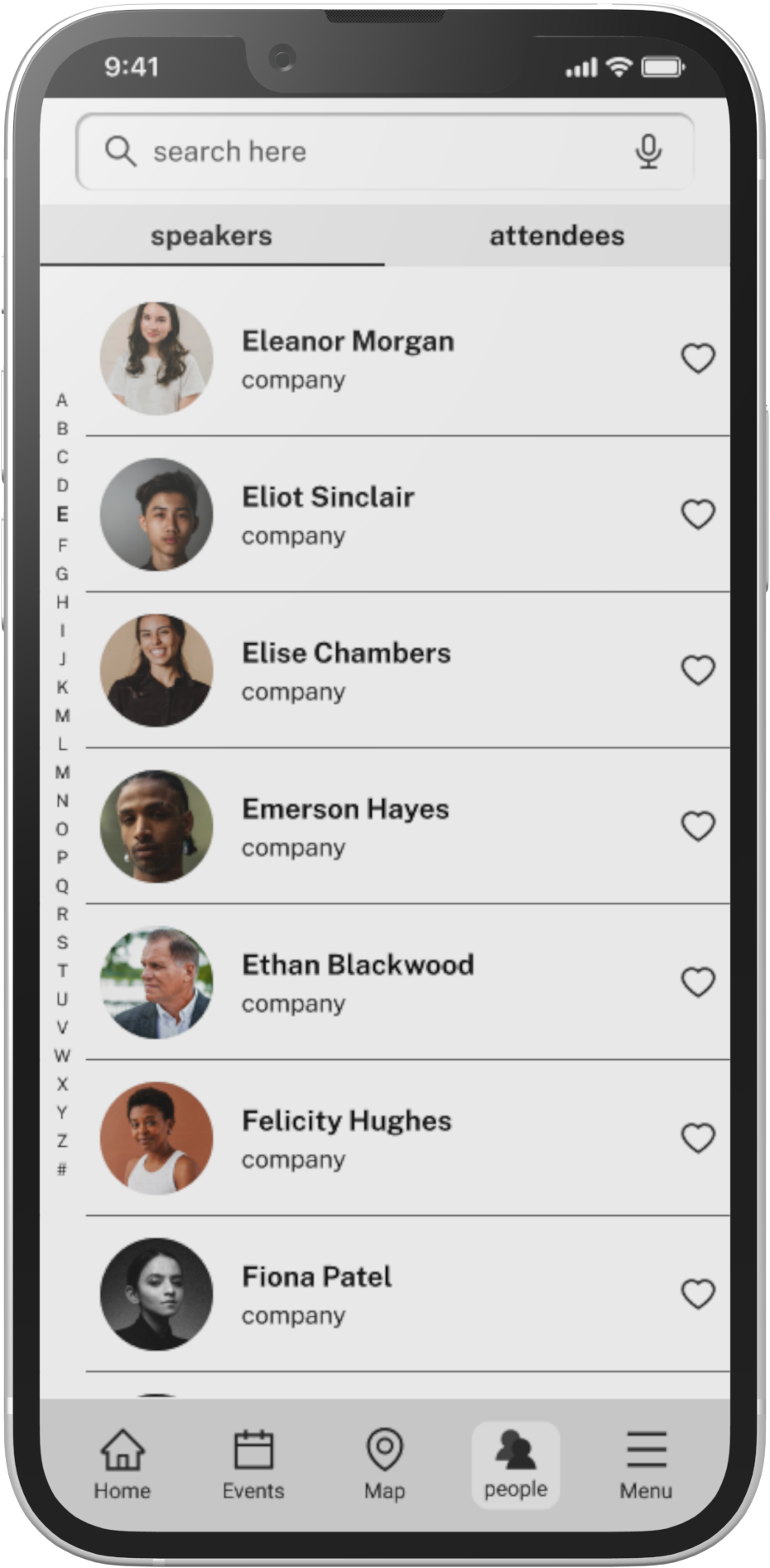
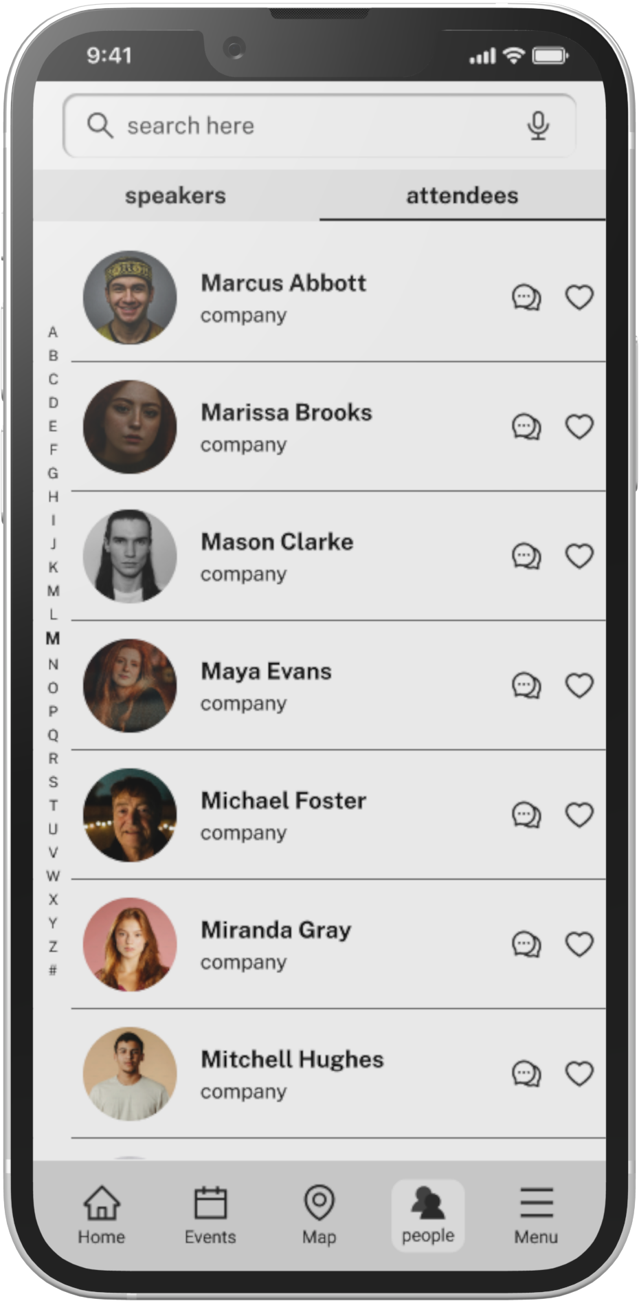
Attending large-scale conferences can be overwhelming and inefficient for many participants. While conference organisers often invest in wayfinding solutions to help visitors navigate unfamiliar venues, these tools alone do not address the broader set of needs that attendees, speakers, and organisers encounter. Conference-goers need a unified digital experience that not only guides them through the venue but also supports networking, access to information, and inclusive participation.

Pointr aimed to explore how their core indoor mapping technology could be expanded into a more holistic conference app that solved practical, emotional, and logistical challenges for all user types.
jump past the process to view the solution

process

Great design doesn’t happen by accident. I broke this project into five structured phases to help uncover user needs, shape meaningful solutions, and deliver a product that balanced functionality with usability.
1. discover
Gathering insights from users and competitors.
2. define
Defining user needs and project focus.
3. develop
Structuring content and sketching screens.
4. deliver
final screens and defining key UI components.
5. distil
Reflecting on outcomes and key learnings
discoverdefinedevelopdeliverdistiltop

discovery

In the Discover phase, I aimed to build a deep understanding of attendees’ needs, frustrations, and expectations. This included researching existing solutions, interviewing users, and identifying clear problems to solve. These insights created the foundation for everything that followed.
users
To ensure the app addressed the needs of everyone involved in a large-scale conference, I identified three main user groups: Attendees, Speakers, and Organisers. Each group brings unique goals and challenges, shaping different requirements for the platform. While all groups were considered in the research phase, this project focuses primarily on attendee experiences.
1. attendees
first timer attendees
experienced attendees
solo attendees
attendees with accessibility needs
international attendees
2. speakers
3. organisers
user persona
Prioritised primary need for each attendee group
To keep the project scope focused and impactful, I prioritised the single most important need for each attendee group. By identifying the key issue that would most improve the experience for each type of attendee, I was able to concentrate design efforts where they would deliver the greatest value, rather than diluting impact across too many smaller considerations.
attendees
first timer attendees
experienced attendees
solo attendees
attendees with accessibility needs
international attendees
first timer attendees
Need
Confidently navigate an unfamiliar venue
First-time attendees often feel overwhelmed by large conference centres, which can lead to stress, missed sessions, and a poor first impression of the event.
solution
Interactive Map and Live Navigation
live positioning and turn-by-turn directions helps new attendees quickly find sessions, amenities, and meeting points without confusion.
experienced attendees
Need
Discover and plan for specific sessions of interest
Regular attendees usually come with clear goals and want efficient tools to search, filter, and schedule the most relevant talks and activities.
solution
Smart Session Discovery
A dynamic event discovery tool with filters and favourites lets experienced attendees pinpoint relevant talks, bookmark them, and build a personalised agenda.
solo attendees
Need
Easily connect and network with other participants
Attending alone can make networking intimidating. These users need simple ways to discover and connect with peers or industry contacts.
solution
In-App Networking
Searchable user profiles and in-app messaging make it simple for solo attendees to find like-minded people and arrange meetups.
Attendees with accessibility needs
Need
Access features that support individual mobility and inclusion
Some attendees rely on specific accommodations like step-free routes or screen reader compatibility to fully participate in the event.
solution
Accessible Navigation Tools
Accessibility-focused map filters and content options provide information on step-free routes, accessible facilities, and tailored navigation. *
International attendees
Need
Clear, Accessible Language Support
Travelling from abroad often means dealing with unfamiliar language, signage, and terminology, making basic navigation and communication harder.
solution
Multi-language Support
Multi-language support across core content and navigation ensures international visitors feel confident and included. *
*
While accessibility and multi-language support were identified as key needs through research, this initial phase focused on delivering the core navigation, networking, and scheduling tools, alongside foundational accessibility features such as voice-activated search and event listings indicating step-free access, sign language interpretation, and transcription availability. Further development is planned in future iterations to extend these capabilities and integrate full multi-language support, ensuring a fully inclusive experience for all attendees.
pain points
Through user research, competitor analysis, and mapping out common scenarios, I identified a range of challenges that attendees regularly experience when visiting large conferences. These pain points informed the design decisions and prioritisation of features throughout the project.
To bring clarity and focus, I grouped the pain points into four categories: navigation and orientation, information access and updates, inclusivity and accessibility, and connection and belonging. This structure ensured that the solutions addressed real frustrations and supported a more seamless and engaging event experience.
pain points flash cards
competitor analysis
To understand the landscape of existing conference apps, I carried out a competitor analysis of both direct and indirect solutions. This helped evaluate current strengths and weaknesses across the market and identify opportunities to differentiate this app experience.

This analysis focused on core features, navigation patterns, UI design conventions, and accessibility considerations. Insights gained from this research directly informed the design decisions and feature prioritisation for the project.
Salesforce Events App
used for Dreamforce, the world’s largest software event, and other Salesforce conferences.
Consumer Electronics Show (CES) App
an award-winning app recognised for best-in-class event technology.
Commonwealth Games App
designed for both attendees and athletes to access schedules, results, and live updates.
Salesforce Events App
competitor screen shots - sales force
CES App
competitor screen shots - CES
Commonwealth Games App
competitor screen shots - commonwealth games

define

In the Define phase, I transformed research findings into clear, actionable design objectives. By distilling the most important problems, identifying opportunities, and outlining key features, I set a focused direction for the project. This ensured that every design decision stayed aligned with user needs and project goals.
defining the challenge
Problem Statement
Many attendees feel disoriented and stressed navigating large, unfamiliar venues.
opportunity
“How might we make wayfinding effortless and build confidence in moving around the event?”
Problem Statement
Attendees struggle to find up-to-date, relevant information amid the noise of multiple sessions and announcements.
opportunity
“How might we help people quickly surface the most important information for their interests and schedule?”
Problem Statement
Networking can feel intimidating, leaving many participants isolated or unsure how to engage with others.
opportunity
“How might we create simple ways for attendees to connect, network, and feel part of the community?”
Problem Statement
People with accessibility needs and non-native speakers often encounter barriers to full participation.
opportunity
“How might we make the experience more inclusive and empowering for all attendees?”
design concept key features
After mapping out users’ priorities, I focused on creating a set of core features that would function as a single, seamless experience. Instead of solving individual problems in isolation, these tools were designed to complement each other—helping attendees feel informed, connected, and in control throughout the event.
User Scheduling Planner
A simple tool that lets attendees build, view, and adjust their personal schedule so they never miss a session they care about.
planning
Live Event Programme Search
A searchable, real-time event programme that helps users quickly find talks, speakers, and activities across multiple days
planning
Attendee Find & Chat
A feature designed to help people discover and connect with other attendees, fostering community and networking.
connection
Interactive Map
An intuitive map that guides attendees through the venue, highlights important locations, and reduces the stress of navigating a large space.
navigation
User Profiles
Personalised attendee profiles to showcase key details, manage preferences, and store access credentials in one place.
navigation
QR Code Venue Entry
A secure, contactless QR code system that makes check-in faster and reduces queues at the venue entrances.
navigation
success criteria
To measure whether the solution achieved its goals, I defined clear success criteria. These outcomes focused on improving usability, supporting attendee confidence, and delivering a seamless experience.
  1. Attendees can confidently navigate the venue without feeling overwhelmed.
  2. Users are able to plan and manage their schedules with ease.
  3. The app enables simple, effective networking before and during the event.
  4. Check-in is streamlined through integrated QR code access.
  5. Accessibility features allow all users to participate fully.
  6. International attendees can access information in their preferred language.

develop

In the Develop phase, I translated ideas into tangible solutions. This included creating wireframes, building the information architecture, and exploring visual design directions. This phase focused on iterative experimentation, feedback, and refining concepts into a cohesive user experience.
site map
To establish a clear and intuitive navigation structure, I created a site map outlining all key sections and user flows. This helped define how users would access core features, understand the hierarchy of information, and move seamlessly through the app.
product site map
wireframing
With the site map in place, I moved into low-fidelity wireframing to explore layout ideas and test how content and functionality could come together on screen. The wireframes focused on core journeys—like planning a schedule, finding sessions, and navigating the venue—and helped identify early usability considerations before visual design began.
wireframe sketches
UI kit
Before moving into polished UI screens, I created a foundational design system to establish the visual language. This UI kit defined core elements like colour, typography, and basic components to ensure a consistent look and feel across the product.
UI kit

deliver

Bringing together the insights gathered during research and discovery, the final solution focuses on clarity, connection, and inclusivity. Designed to support the needs of diverse attendees, organisers, and speakers, the app combines practical wayfinding with real-time updates, networking tools, and accessible features — all within an intuitive interface. Below, you'll find a walkthrough of the key screens and how they respond to user needs uncovered earlier in the process.
From challenge to solution
Every aspect of the app was designed in direct response to real needs uncovered during research. This section outlines 4 key challenges identified through user insight — and the solutions crafted to address them. Each solution reflects a focused effort to improve the experience for different types of conference attendees.
Confident Navigation in Complex Venues
problem
Large conference centres can feel like a maze, especially for first-time or international attendees. Without intuitive wayfinding tools, users often struggle to locate sessions, amenities, or networking spaces. This creates unnecessary stress, increases support requests, and detracts from the overall experience.
solution
I designed a familiar, accessible mapping system with clear visual cues and turn-by-turn navigation. Users can quickly search or tap popular locations, view directions from their current position, and access essential information such as walking times and distance estimates. This empowers attendees to move confidently throughout the venue while reducing the burden on event staff.
app screen shot map locations
app screen shot map route
app screen shot map navigation
Discovering and Accessing Key Events
problem
At large conferences, attendees often struggle to discover relevant sessions among dozens of overlapping talks and workshops. Limited on-site signage, crowded schedules, and lack of clear accessibility information can lead to confusion, missed opportunities, and frustration, especially for those with mobility or scheduling constraints.
solution
I designed an intuitive event discovery flow that helps users quickly find relevant sessions by filtering by topic, speaker, and type. Clear visual cues, colour-coded cards, and chronological ordering improve scannability. Dedicated event pages consolidate details and accessibility information, while live-streaming ensures remote access. To support personal planning, attendees can save events to a My Schedule tab by marking them as favourites, creating a tailored agenda that keeps important sessions front and centre.
app screen shot session list
app screen shot event overview
app screen shot my schedule
Creating Personalised, Connected Experiences
problem
Conferences often bring together thousands of attendees, yet making valuable connections can be surprisingly difficult. Solo participants, newcomers, or international visitors may feel disconnected and unsure how to meet relevant people. Traditional event directories are fragmented or incomplete, forcing users to hunt across multiple channels to discover speakers, attendees, and networking opportunities that align with their interests.
solution
A rich user profile system allows attendees to share their background, interests, and event goals, creating a foundation for tailored recommendations. The unified People directory combines speaker and attendee listings into a single, searchable hub with advanced filters, making it easy to discover and connect with others. Private messaging and profile-based suggestions empower participants to arrange meetings, build professional relationships, and feel part of the community before, during, and after the event.
app screen shot profile
app screen shot speakers list
app screen shot attendees list
Seamless Entry and First Impressions
problem
Conference attendees often face disjointed onboarding: complex registration processes, multiple accounts, and poorly branded experiences that make it unclear whether they’ve even logged in correctly. After sign-in, crowded or generic home screens can leave users unsure where to start, forcing them to hunt for basic actions like event schedules, maps, or networking tools. This friction not only delays engagement but also damages trust in the event’s organisation.
solution
A simple, branded login screen welcomes attendees with clear event imagery and one-tap sign-in using pre-registered credentials—eliminating unnecessary steps. Once logged in, the clean, focused home screen provides an immediate sense of orientation, highlighting essential navigation and curated content without visual overload. This approach ensures attendees feel instantly equipped and inspired to explore, reinforcing trust and setting a clear tone for the overall experience.
app screen shot login
app screen shot home page
app screen shot main menu

distil

Reflecting on what was learned, what worked, and where the project goes from here.


The design journey for this interactive event app has laid strong foundations through a user-centred approach. With insights gathered from real attendees, the design evolved to tackle practical, emotional, and logistical challenges with clarity and care. This final phase brings together the key takeaways, outlines what comes next, and highlights the personal growth achieved through the process.
next steps
  • User Testing
    Conduct moderated testing to observe real attendees using the prototype, revealing usability insights and opportunities for refinement.
  • Iterative Design
    Use findings to evolve the design further, fine-tuning both functionality and interface through informed iteration.
  • Development
    Once refined, the app will be ready for handoff and development in collaboration with technical teams.
  • Accessibility Testing
    Conduct accessibility audits to ensure the app supports inclusive experiences — including screen reader compatibility, colour contrast, and assistive technologies.
  • Multi-stakeholder Feedback Loops
    Gather additional feedback from event organisers and conference staff to balance user needs with operational realities.
  • Performance Considerations
    Explore performance optimisations for large-scale venues with thousands of concurrent users, ensuring smooth real-time updates.
learning outcomes
  • Turning Research into Impact
    Designing with clear, validated user needs at the heart of the process leads to stronger, more useful solutions.
  • Building Design Systems
    Creating and using a lightweight design system brought clarity and consistency across the UI.
  • Working Efficiently
    Leveraging reusable UI components and a modular structure improved both speed and scalability.
  • Strengthened Communication & Storytelling
    Through building the case study and stakeholder presentations, I refined how I communicate design thinking clearly and persuasively — a skill critical for cross-functional collaboration.
  • Improved Prioritisation & Scope Management
    Balancing a wide range of user needs taught me how to scope features effectively while staying focused on real value delivery.
  • Deeper Empathy for Diverse Users
    Exploring pain points around accessibility, language, and inclusion strengthened my ability to design with empathy for underrepresented voices.
app mock up